Art That Changes as You Move
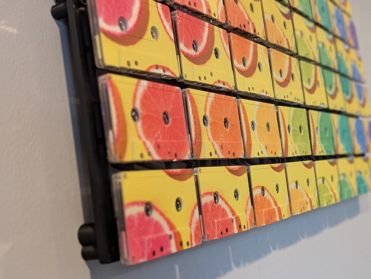
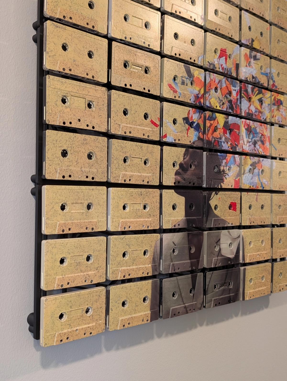
Look at the citrus artwork from the side. Before the fruit has much opportunity to make its case, the edge of the piece tells you something useful: this is an object with depth. The cassette shells stand forward. Small shadows gather underneath them. The spaces between tapes become dark lines.
Move towards the front and the colour takes over. The grid settles into the picture. Move closer and it separates again.
That changing balance is one of the reasons we make Mixtape Mosaic with actual cassettes. The image has a physical structure, and your position in the room determines how much of that structure you see. A wall is a perfectly good place for a picture. It is also a perfectly good place for an object.
Three distances, one piece
There are three useful ways to look at a cassette mosaic.
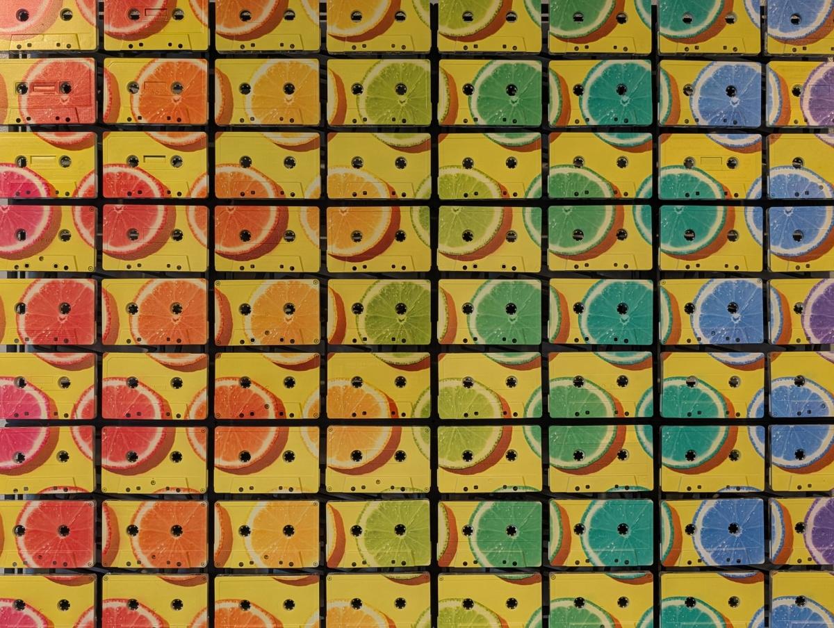
At room distance, start with the overall composition: the colour, the subject, the shape of the artwork, and where your eye lands. In the citrus piece, the yellow field and progression of coloured fruit read before the individual tape details do.
At conversational distance, the grid becomes clearer. The picture continues across seams, but the seams remain visible. The eye gets the whole image and the repeated units at the same time.
Close up, look at the shell edges, openings, surface marks, and changes between cassettes. Small details that would disappear in a photograph of the whole piece become part of the experience.
None of these is the correct distance. They are different rewards for looking.
The gaps belong to the composition
A line between two cassettes is a real break in the surface. It can interrupt a curve, cut through a patch of colour, or divide a face. The image has to work with that break.
This is why a cassette mosaic has a particular visual rhythm. Repeated edges give it structure, while the artwork provides movement across that structure. In a busy image, the grid can help organise what you see. In a quieter image, the grid itself becomes more prominent.
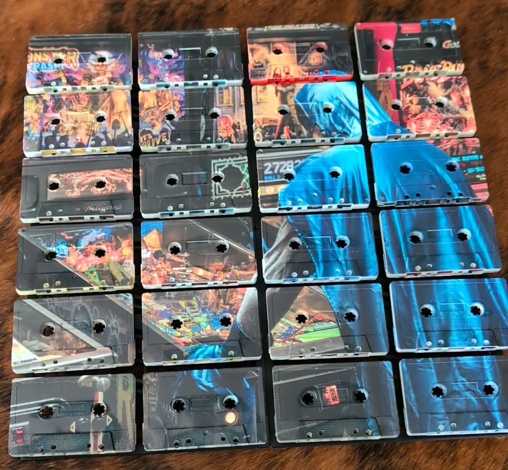
The portrait is a good example. The concentrated image sits against calmer areas of cassette surface. You can follow the face, then notice how its edges relate to the repeated rectangles around it.
The artwork is not made more interesting simply by having more interruptions. The interest comes from the relationship between the interruptions and the image. A grid can be a useful discipline. It can also be a menace to a badly placed eye. We prefer to discover that in the preview.
Light has something to work with
Depth gives light an edge to catch and a recess to leave in shadow. When illumination comes from the side, that relief becomes easier to read. When the light is more frontal and diffuse, the overall image often becomes the stronger impression.
You do not need gallery lighting to enjoy this. Ordinary room light already changes through the day. A nearby window, a lamp, or the direction of an overhead fixture can alter which edges you notice.
The useful thing is to observe the place where you intend to hang the work. Is the light mostly coming from one side? Does the wall fall into shadow in the evening? Will a lamp sit close enough to make part of the surface much brighter than the rest?
Those questions tell you more than buying a particularly serious-looking bulb and hoping for the best. I have considerable faith in lamps. I have less faith in lamps chosen entirely by adjectives.
Where movement helps
A piece can work particularly well where you see it from more than one angle: beside a seating area, along a route through the room, or on a wall that comes into view as you enter.
You first encounter the overall image. As you walk past, the depth becomes visible. When you stop nearby, the cassette details reward the pause.
That does not mean it needs a corridor, or that every room should become an exhibition route. A single wall opposite a favourite chair can work beautifully. The point is to consider the actual sightline rather than only the straight-on photograph.
In a small room, you may encounter the piece at close range most often. Material detail will have more presence. In a larger room, the broad image needs to carry farther. Scale and composition should be chosen together.
What the photographs can tell you
When viewing artwork online, compare a front view with an angled detail. The front view helps you judge the composition. The side view helps you judge the object.
Look for the actual edges and the shadows they cast. Notice how far the work projects from its supporting surface. Check whether the image still holds together when the cassette openings become prominent.
Our photographs show this relationship directly. The citrus close-up includes the side of the build and its shadow on the wall. The portrait gives you a different balance of open shell surface and concentrated image.
A photo cannot show every change that happens as you move around a piece. It can, however, give you better evidence than a perfectly flat image alone.
Living with the texture
The appeal of a dimensional artwork is that it continues to give you something to notice after the first impression. The bold image gets your attention. The surface gives that attention somewhere to go.
We want both to be worth your time.
There is a quiet pleasure in looking at something physical after a day spent looking at screens. Edges have depth. Shadows have a cause. You can move your head and the object answers without requiring a software update.
For Mixtape Mosaic, that physical encounter is central. The cassette is familiar, but its presence in the artwork is active. It changes the way the image occupies your room.
If you are choosing between images, start with what you want to see from your normal seat. Then zoom into the preview and ask whether the broken surface adds something you like. Our companion note on choosing a mosaic for your room takes that decision further.
Preview your mosaic