When the Subject Is Analog Too
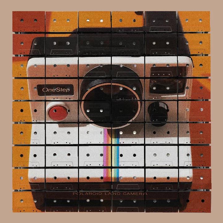
The large black circle in the camera study is meant to be a lens. It is also crossed by cassette seams and punctured by reel openings, which is inconvenient if the aim is perfect illusion and rather useful if the aim is to let the artwork admit how it was made.
Around it sits a warm field of orange, cream and brown. The outline reads as an instant camera from across the room. Come closer and the rectangular tape faces resume their authority. Label zones, openings and shell edges remain legible inside the picture of another analogue object.
This is where a particular kind of Mixtape Mosaic becomes interesting. Sometimes the cassettes carry a portrait, a pet or a landscape. In these new studio artwork studies, they carry a camera, a jukebox and a boombox surrounded by coloured tapes. The material and the subject come from related visual territory, but they do not simply repeat one another. They argue over the same space.
The material is already speaking
A real vintage cassette face is not neutral. It arrives with two reel openings, a central label area, screws, bevelled edges, moulded lines and the occasional older mark that remains visible through a lighter passage of print. Put an image of vintage technology across those faces and the surface begins making connections before anyone has written a caption.
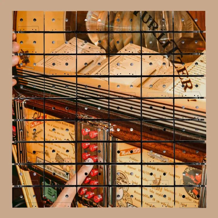
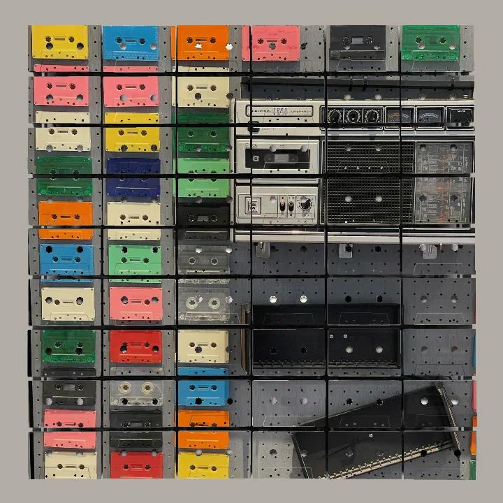
The camera lens becomes a large circle assembled from many small rectangles. The jukebox's chrome lines travel across the dark gaps between tapes. In the boombox study, printed images of cassettes appear on actual cassette faces. Fortunately, the visual work is clearer than that sentence.
The subject reads because its largest shapes are strong. The material remains present because the image cannot smooth away every opening and edge. One old object depicts another while continuing to look like itself.
Recognition comes first
The first job is recognition. The camera study has a large central lens and a blocky body. The jukebox has its curved case, striped grille and line of numbered buttons. The boombox has a broad rectangular mass, a dark speaker area and a surrounding field of smaller coloured cassettes.
Those silhouettes carry the subject before the viewer starts inspecting the surface. This matters on a cassette grid because fine details will meet interruptions. A tiny dial can land on a reel opening. Lettering can cross a seam. A narrow highlight can disappear into a gap with the efficiency of a receipt placed somewhere safe.
Strong broad forms can survive these events. They may even benefit from them.
Three different conversations
The camera study is built around one dominant shape. The circular lens pushes against the cassette rectangles, and the contrast makes both geometries clearer. The pale lower body leaves more room for shell features to register. It is the quietest of the three, though a camera the size of a wall is only quiet by comparison.
The jukebox study is denser. Warm amber colour, striped lines, glassy areas, small labels and red buttons spread through the grid. Here the tape openings do not merely interrupt one broad object. They join a surface already full of mechanisms. The useful tension is between two systems: the printed jukebox parts and the repeated cassette parts.
The boombox and cassette study is more direct. Coloured tapes occupy one side while the stereo equipment fills the other. The real cassette grid sits beneath both. The image acknowledges the material openly, but the composition still needs hierarchy. Bright shell colours lead on the left; the larger dark equipment shape anchors the right. Without that difference in scale, the piece could become a meeting at which every rectangle has requested equal speaking time.
Nostalgia is not the whole job
These subjects are familiar to many people for reasons beyond their shape. Cameras, jukeboxes, radios and tapes can recall rooms, records and habits that have moved elsewhere. That association is welcome. It is not sufficient.
An artwork still has to work for someone who did not own that camera, use that jukebox or spend a Sunday persuading a radio aerial to recognise a station. Colour must hold together. Large shapes must read. The grid must contribute more than a period reference.
This is why the physical cassette matters. In a finished Mixtape Mosaic, the contemporary image is UV printed onto real vintage cassette faces and assembled as a dimensional panel-based wall artwork. The support has openings, edges and shadows of its own. It does not merely tell you the subject belongs to the past. It changes how the subject is seen now.
The honest pleasure is in that meeting. A familiar object is not preserved under glass or flattened into decoration. It becomes part of a new image while retaining enough of its own character to complicate the view. Memory may bring someone to the piece, but form, colour and material are what give them a reason to keep looking.
Choosing an image that agrees with the material
If you are considering technology, music equipment or any similarly detailed subject, begin with three questions:
- What is the one shape that makes the object recognisable?
- Which details can tolerate a cassette opening or seam, and which ones cannot?
- Does the subject gain something from being carried by tapes, beyond the simple fact that both are old?
The third question is the most important. A camera can gain a tension between its round lens and the rectangular grid. A jukebox can gain another layer of mechanical rhythm. A field of printed cassettes can become a direct comparison between pictured object and physical object.
That relationship is more useful than nostalgia applied with a large brush.
Explore the artworkThe Mixtape
J-card: “THE OBJECT IN THE PICTURE”
Side A: the camera
- Paul Simon, “Kodachrome”: bright colour and a camera named directly, which saves us pretending the connection is subtle.
- The Kinks, “Picture Book”: small images arranged into a larger account of what is remembered.
- The Who, “Pictures of Lily”: a sharp outline, a crowded arrangement and no fear of the photograph becoming the subject.
- The J. Geils Band, “Freeze-Frame”: for the moment a moving thing agrees to become a picture.
- Outkast, “Hey Ya!”: colour and movement refusing to remain politely inside the frame.
Side B: the radio- The Buggles, “Video Killed the Radio Star”: old and new media conducting their disagreement in an impeccably catchy form.
- Elvis Costello and the Attractions, “Radio Radio”: clipped edges and firm opinions, both useful qualities on this side.
- Kraftwerk, “Radioactivity”: machinery made musical without asking the machinery to become sentimental.
- Queen, “Radio Ga Ga”: the broad, recognisable silhouette of the sequence.
- The Selecter, “On My Radio”: brisk lines and a final rhythm that keeps the hardware awake.