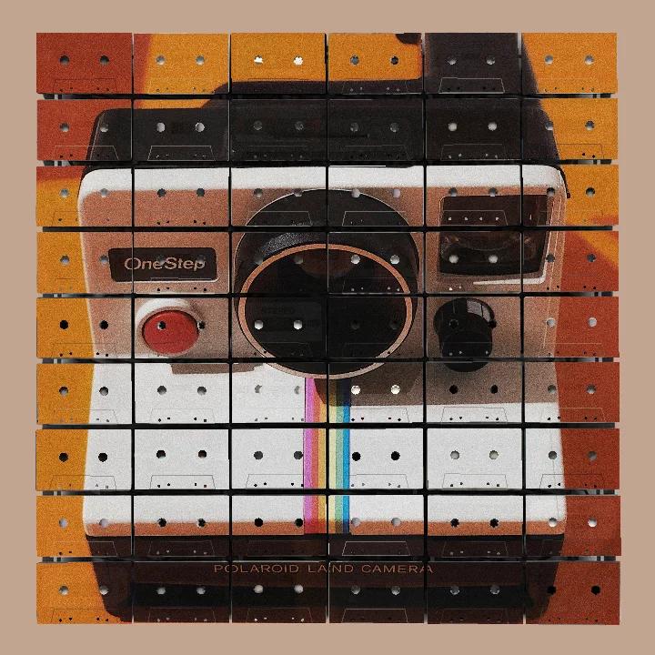
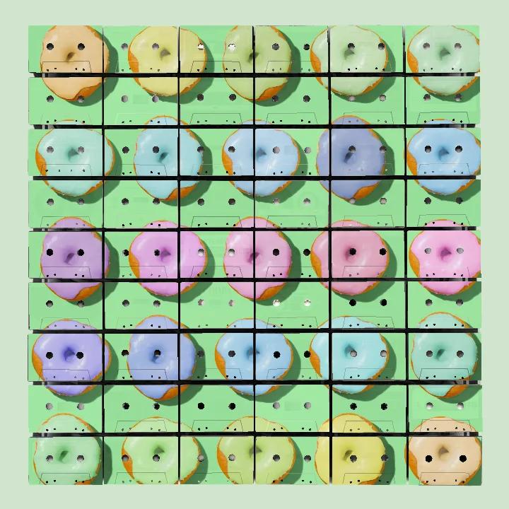
The Grid Is the Agreement
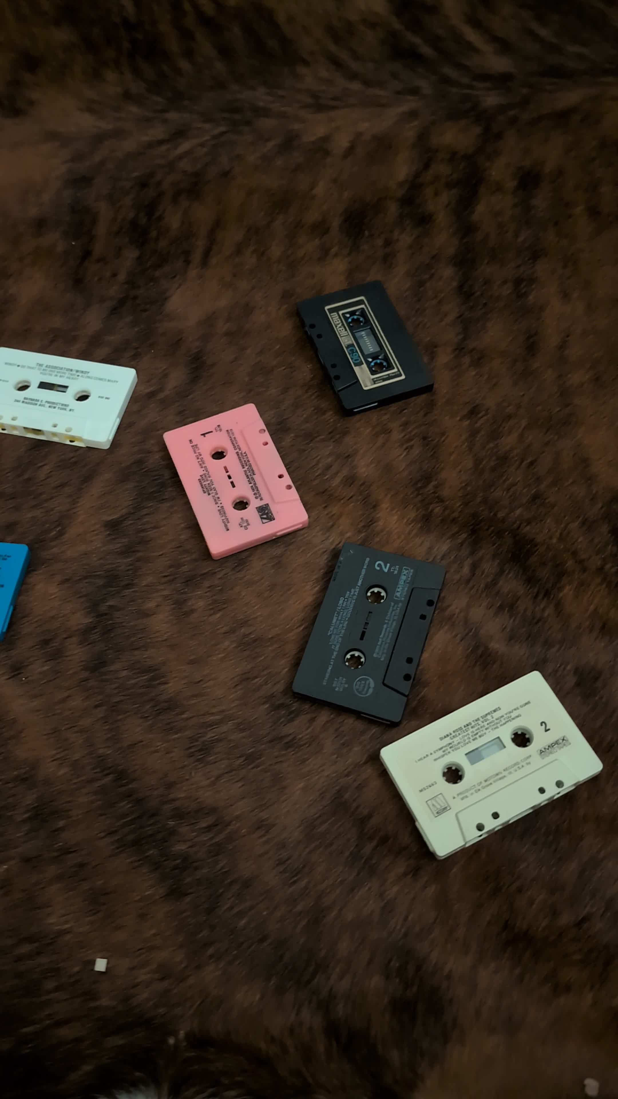
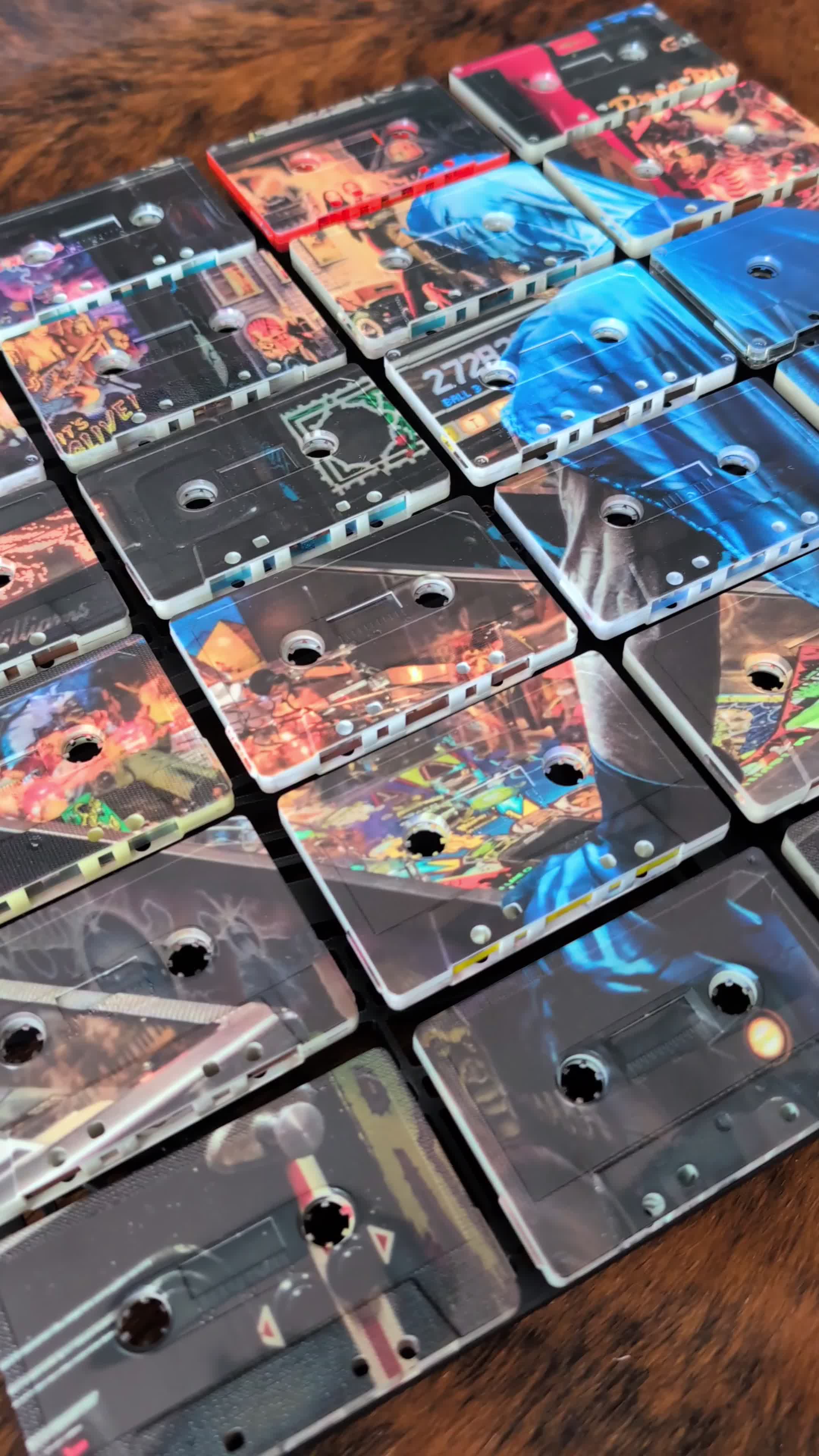
The pink cassette is the first one to misbehave. Set among white, black, grey and blue shells, it refuses the useful anonymity of a standard component. Its label is not arranged like its neighbours. Its window is different. Even before an image reaches it, the thing has opinions.
This is precisely why it belongs.
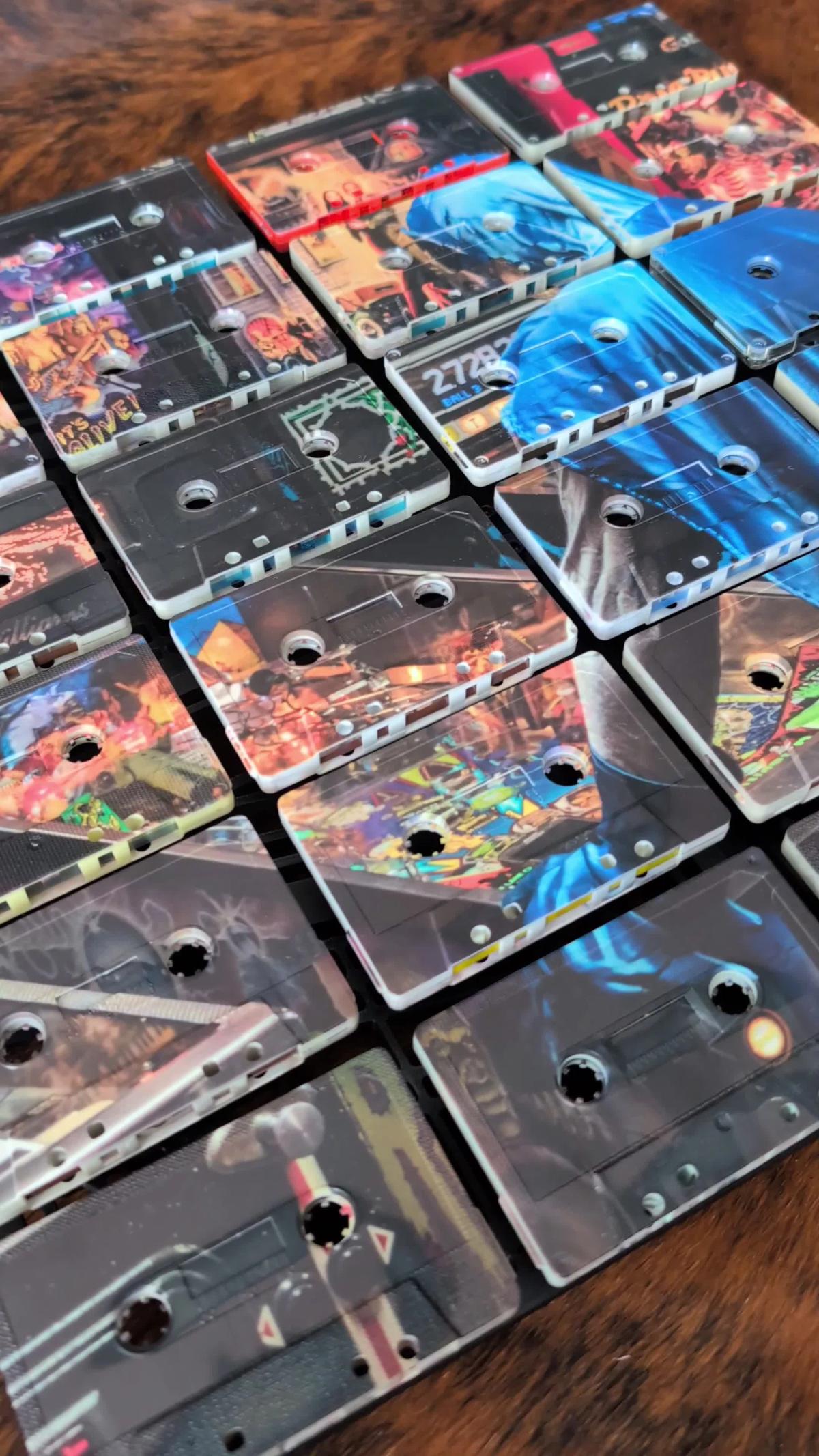
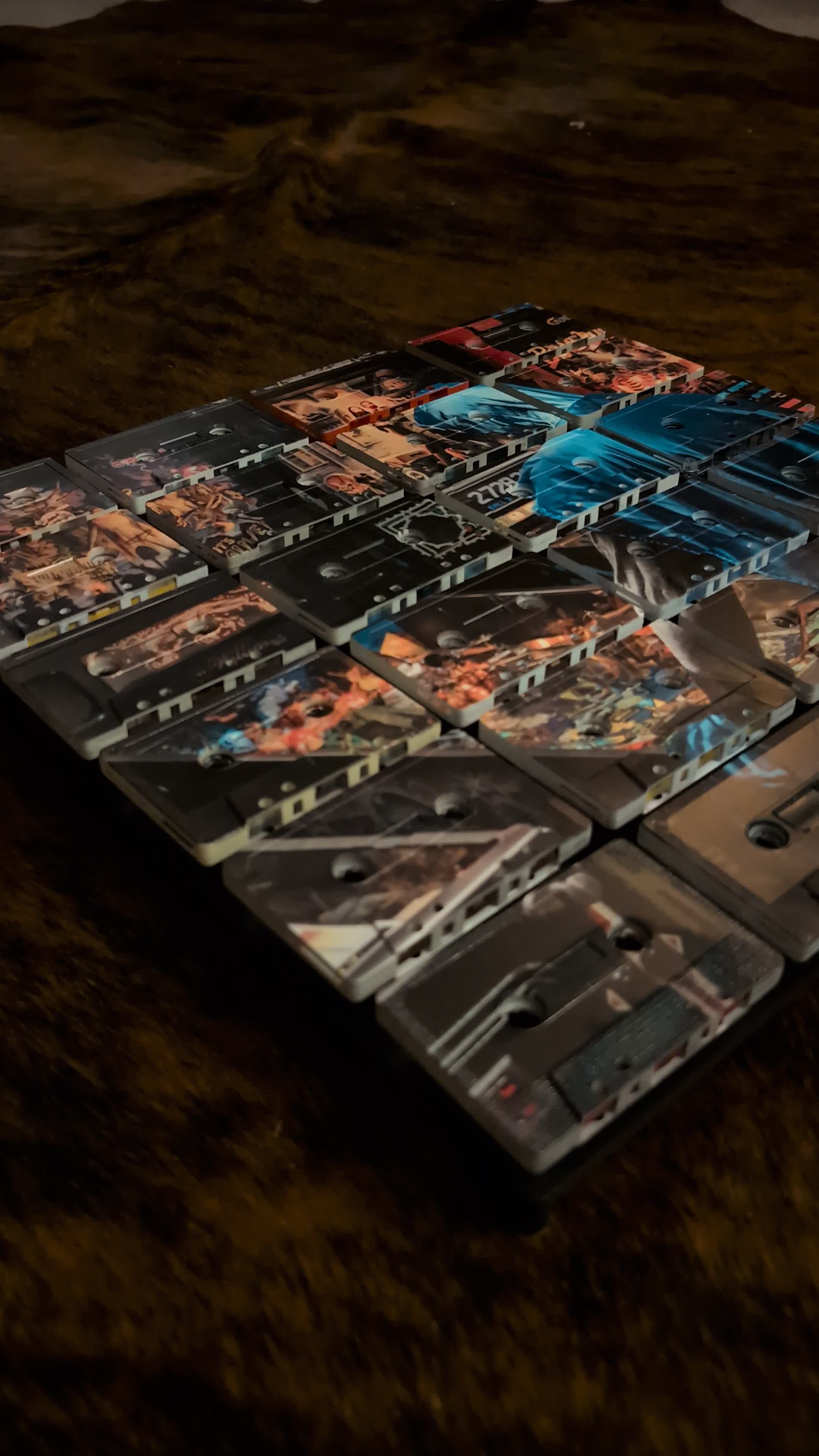
A Mixtape Mosaic is made from real vintage cassette faces, and real vintage cassette faces do not arrive as a polite matching set. Some are pale, some dark. Labels sit high, low or across nearly the whole face. Windows vary. Type changes. A handwritten mark may have survived. When a lighter-coloured part of the contemporary image is UV printed across them, a little of that earlier label can still show through.
That small reveal matters, but not because every old mark deserves a museum label and a velvet rope. It matters because the artwork is not pretending to be a flat picture of cassettes. The material remains visible. The new image gets the room, but the objects occasionally clear their throats.
What actually repeats
The cassette is already a useful unit. It is a compact rectangle with two reel openings and a recognisable mechanical face. Put several together and repetition appears immediately, even when the shells and labels disagree about practically everything else.
The grid gives that repetition discipline. Rows align. Gaps become deliberate. The edges establish a steady beat. The openings punctuate the surface. I am tempted to call this order, though that suggests someone has successfully tidied a drawer, and I have no evidence that such a thing has ever occurred.
Across that structure, the printed image supplies the larger movement. A blue passage can travel over several cassettes. A dark form can gather separate faces into one shape. A highlight can cross a gap, vanish at an opening and continue on the next object. From across the room, the eye assembles those fragments quickly. Close up, it becomes aware that the fragments have their own colours, mouldings, labels and edges.
The repeated element, then, is not sameness. It is position.
Variation needs a boundary
There is a difference between useful variation and visual noise. If every part asks to be the main event, the result has the conversational quality of six radios tuned to different stations in a tiled bathroom.
The panel and grid provide the boundary. They let the individual cassettes keep their physical character without asking the overall image to surrender. The UV print does another part of the work. Dense, darker areas tend to quiet what sits beneath them. Lighter areas allow more of a shell colour, old typography or label edge to register. Neither treatment is automatically better. What matters is where each one occurs within the composition.
That distinction is useful when looking at the finished work. Notice how the broad blue forms connect cassettes whose faces are not identical. Then look at the warm passages, where label shapes and older markings are easier to catch. The large image is doing the organising. The cassettes are supplying the exceptions.
Why matching everything would lose something
An array of identical new shells could produce a cleaner baseline. It would also remove one of the most particular things about this work: the sense that a contemporary image has met a group of existing objects rather than a batch of obedient blanks.
The difference is easiest to see in the margins and pale passages. A cream edge meets a black one. A label block sits behind a printed colour. One reel opening has a different surround from the next. These are not decorations added to suggest age. They belong to the cassette itself.
That does not make every irregularity sacred. Composition still has to work. Faces still have to sit in a coherent arrangement. The image still needs to read. The older layer earns its place by giving the surface more information, not by demanding that we admire every scuff individually.
Three distances
There is a practical way to judge this balance, whether you are choosing an artwork online or standing in front of one.
First, step back until the full subject reads. At that distance, look at the image, the broad colour areas and the proportion of the panel. If the work only functions when your nose is almost touching it, the cassettes have staged a small administrative takeover.
Second, move to ordinary conversation distance. This is where the grid, openings and interruptions become active. You should still see the subject, but you should also notice how it has been divided and rebuilt.
Finally, get close enough to inspect one cassette. Look for the edge of an original label, a change in shell colour or a marking that the print has not completely buried. That last view is not a bonus feature. It is evidence of what the artwork is made from.
The three readings should support one another: image, structure, object. None needs to win permanently.
The useful agreement
I'll say this plainly. The character of a Mixtape Mosaic does not come from forcing old things to look new, or from leaving them so untouched that no new image can take shape. It comes from allowing both moments to remain legible. The cassette carries its previous life quietly; the artwork gives it a new job.
The grid is the agreement that makes this possible. It asks each object to occupy its place, not to erase its differences. That is enough structure for the image to hold and enough freedom for a pale label, a black shell or one very determined pink cassette to remain itself.
Explore the artworkThe Mixtape
J-card: "THE THINGS THAT LINE UP"
Side A
- Chic, “Good Times.” Guitar, bass, drums and strings each keep a distinct job while the groove makes them sound inevitable.
- Joy Division, “Disorder.” A firm pulse carrying parts that feel as if they might pull in different directions at any moment.
- Yellow Magic Orchestra, “Rydeen.” Precision without sterility, which is harder than precision with sterility and considerably more useful.
- Tom Tom Club, “Genius of Love.” A collection of small, unmistakable elements that becomes larger through repetition.
- Television, “Marquee Moon.” Two guitars sharing a structure without being asked to share a personality.
Side B- The Specials, “Ghost Town.” Space, rhythm and separate voices arranged with exact restraint.
- XTC, “Making Plans for Nigel.” Clipped patterns made human by all the awkward detail around them.
- Can, “Vitamin C.” A disciplined groove with a surface that never sits politely still.
- Gang of Four, “Damaged Goods.” Guitar and bass crossing like sharp lines in a very well organised argument.
- Fela Kuti, “Water No Get Enemy.” Many independent parts, patient enough to become one immense arrangement.