Real Tapes, New Art
A cassette is a rather elaborate surface on which to put a picture. It has holes in inconvenient places, raised edges, a window, two reels, and a number of firm opinions about where a straight line ought to go. Paper is considerably more cooperative. We chose the cassette.
That choice is the beginning of Mixtape Mosaic. Our art is made with real vintage cassette tapes, arranged into a grid and printed with artwork across their faces. From a few steps away, you see the image. As you approach, you begin to see what carries it: individual shells, gaps, small variations, and the unmistakable geometry of an object once designed to hold music.
The material is doing something. That matters to us more than the fact that it is old.
The cassette has a job
We use vintage cassettes because their physical character contributes to the finished piece. The rectangular shell gives the work its rhythm. The openings interrupt the image. The seams create a repeating dark line. The depth gives light somewhere to land.
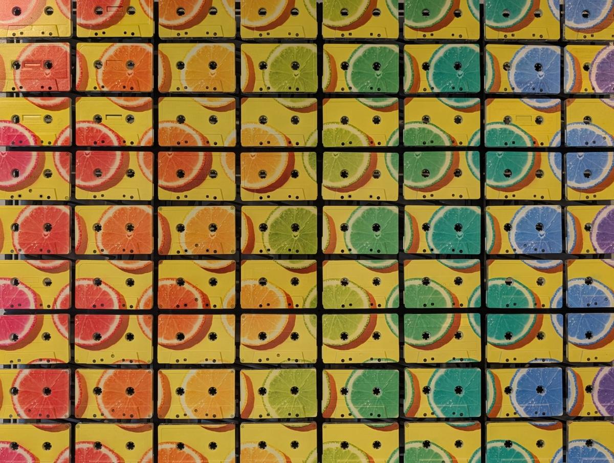
You can see this in the citrus artwork. The fruit moves across the whole composition, while each cassette remains visibly separate. A circle continues over a gap; a slice of orange passes around a reel opening; the yellow ground sits against the dark divisions between tapes. The image and the structure are both readable.
Neither needs to apologise for the other.
A cassette printed on a flat sheet could reproduce the outline. It would not reproduce the small shadow under an actual shell, or the change in emphasis when you move to one side. Those are properties of the object itself. We want them involved.
Familiar material, different purpose
The cassette comes with associations. Handwritten labels, borrowed albums, a car stereo that required a persuasive thump. A Sony Walkman has many virtues; its willingness to forgive weak batteries is not among them.
You do not need any of that history to enjoy the art.
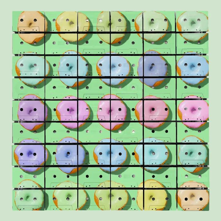
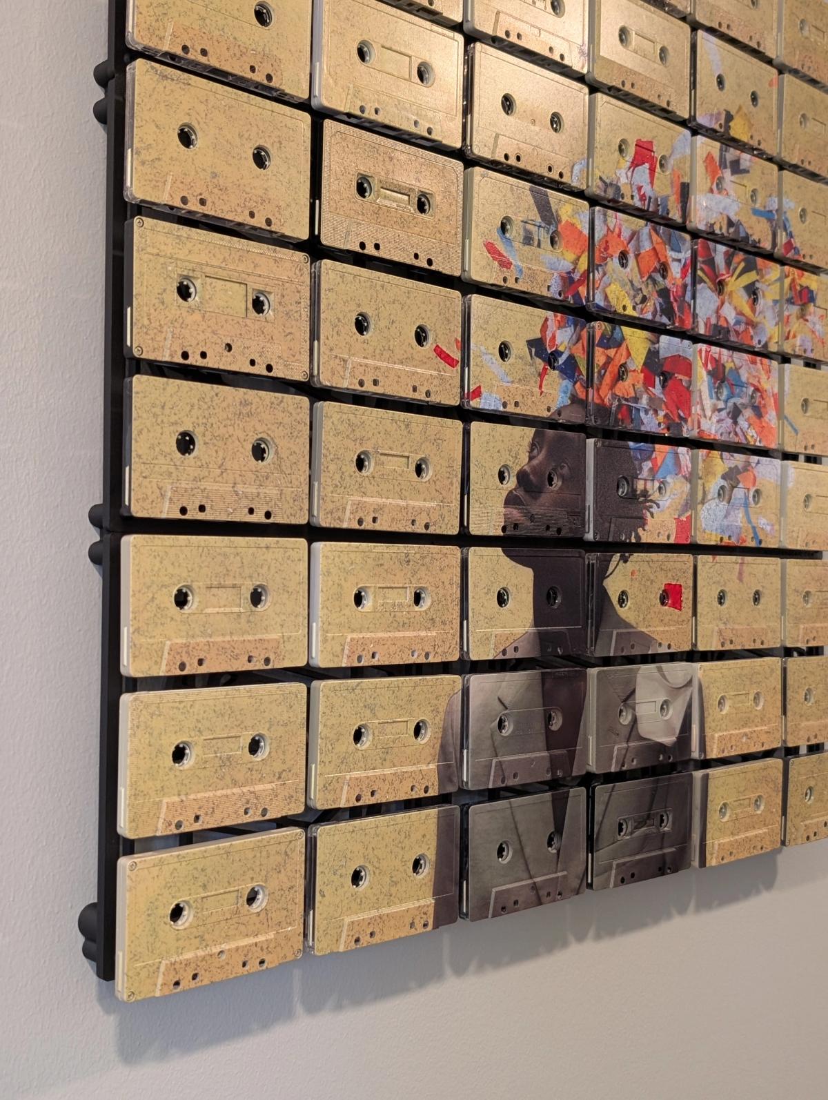
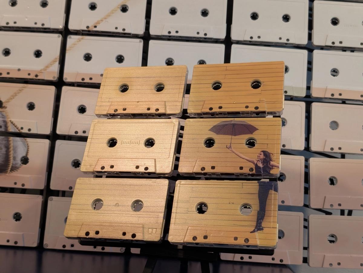
The portrait shown here works as a portrait. The citrus works as colour and pattern. A personal photograph works because the image means something to its owner. Knowing the material adds another layer, but it is not an entrance examination. We would rather make art that catches your eye than require you to submit a list of albums you owned in 1989.
This is an important part of the brand: an analogue material can belong in a contemporary room. It can be playful, graphic, quiet, personal, or quite assertive. The cassette supplies a visual language, not a compulsory decorating decade.
What real materials bring
Vintage shells differ. Their colours, labels, marks, and details can vary from tape to tape. Depending on the artwork and how much of the material is left visible, those differences may sit quietly beneath the image or become a larger part of the composition.
We work with that variation. We also build a deliberate artwork.
There is a useful distinction between the character of a material and the decisions involved in using it. A scuff belongs to a tape. The image crop belongs to the composition. The shape and scale of the finished piece belong to the design. “Vintage” is not a reason to stop paying attention to the last two.
The result is a piece with a consistent visual idea and a material surface that has its own particulars. Two builds can share artwork without sharing every tiny detail. That is why the preview shows the direction of the piece, while the real tapes contribute their own variation.
An image built from parts
A mosaic asks the eye to assemble separate elements into a whole. Here, those elements remain recognisable objects. That gives the work two levels of interest: the picture and the construction of the picture.
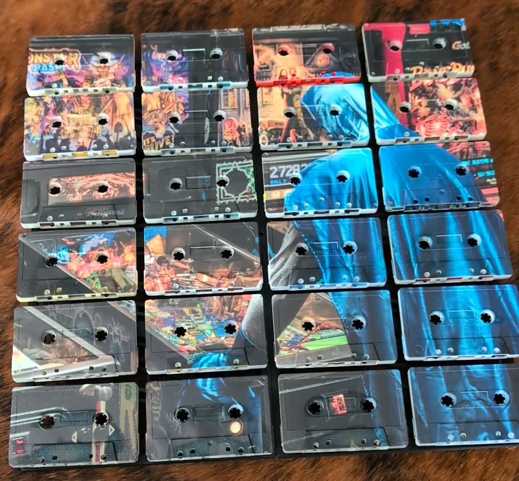
In the portrait, look at the relationship between the face and the quieter tape surfaces around it. In the small six-tape work, notice how much can be communicated with a limited field. In the citrus, follow one coloured shape across several shells.
These are useful ways to look at the work before choosing your own. Do you want the image to dominate from across the room? Would you enjoy discovering the tape details at close range? Do you prefer open areas where the material can speak, or a composition that carries colour over most of the surface?
There is room for all of those approaches. The best choice is the one whose balance you enjoy looking at.
What we want the brand to stand for
Mixtape Mosaic begins with a clear promise: the material you see is real, and it contributes to the art.
Our visual world can be bold without being careless. It can acknowledge music without turning every image into music memorabilia. It can use vintage objects without inventing an emotional biography for each one. An old cassette may have held someone's favourite album. It may also have held a meeting. We are not in a position to improve its references.
What we can do is give that physical object a considered new role.
There is something satisfying about an everyday material receiving this much attention. The small details become worth looking at. An object that once sat in a drawer becomes part of a room someone has chosen to make their own.
That is enough meaning to begin with.
If you are new to the work, start in the artwork library. Choose an image that holds your attention, then consider what the cassette surface adds. The process page explains the build; the customizer lets you explore a piece of your own.
Explore the artwork