One Surface, Two Images
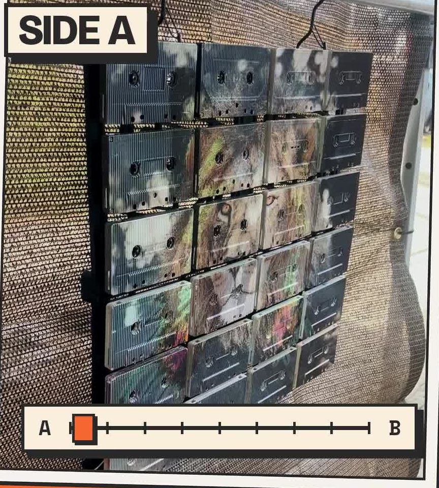
A lion is a fairly definite thing to put on a wall. It has a face, a mane and very little reason to be mistaken for a butterfly. In the two-image cassette piece shown here, however, that distinction depends on where you stand. Move to another position and the broad animal face gives way to wings.
The cassettes have not moved. You have.
This is a particular direction within Mixtape Mosaic: one physical surface carrying two images that become more prominent from different viewing positions. It is not a description of every piece we make. An ordinary cassette mosaic changes in emphasis as light catches its edges; this treatment changes the picture you can see.
That difference deserves more than a quick demonstration. It asks a useful design question: if an artwork has two views, what makes both worth keeping?
Two compositions, one object
The owner-supplied show footage records the wall piece from opposing positions. In one view, the lion's eyes, muzzle and mane dominate. In the other, a green-and-dark butterfly becomes the main shape. Pale areas and fragments of colour surround it. The same cassette grid remains visible throughout.
The comparison below uses stills from that footage, with its original captions retained. These are views of an actual artwork on the show display, not two digital mockups presented as a finished object.
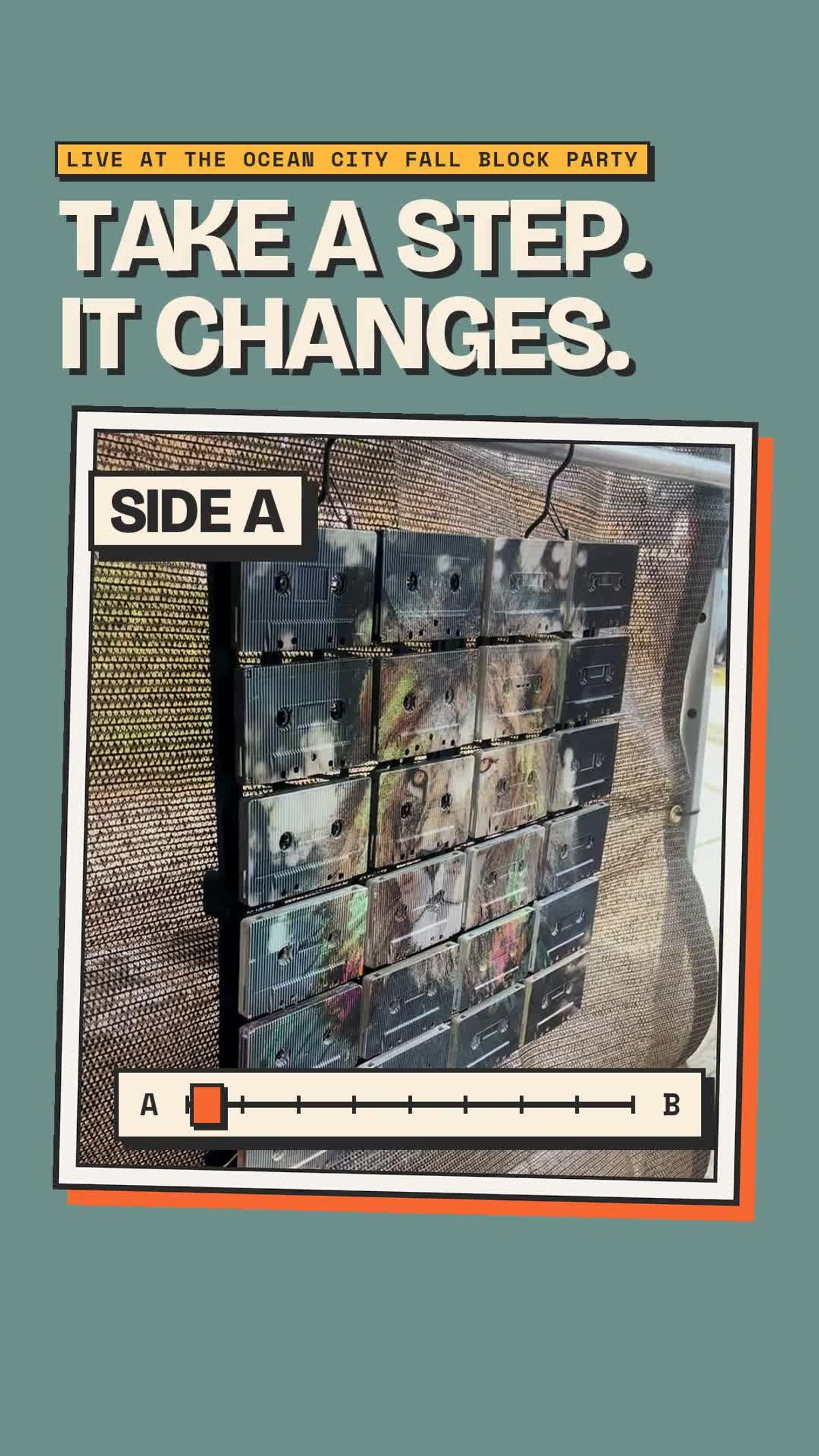
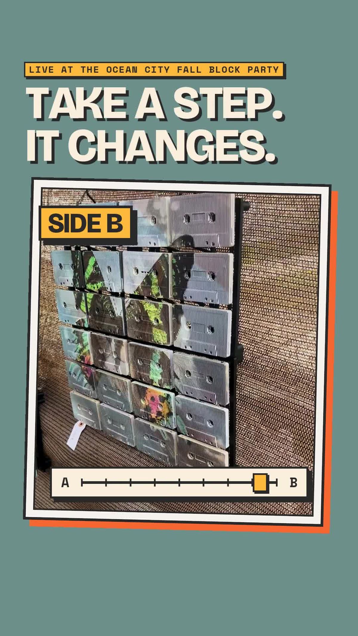
The appeal is not simply that a lion and a butterfly are different. They occupy the surface differently. A face concentrates attention around its features. Spread wings establish a wider outline. The change reorganises the composition rather than merely substituting one colour for another.
That is the standard we would use to judge any proposed pairing. Each image needs its own reason to be there. If one is compelling and the other exists chiefly to demonstrate that something clever has happened, half the artwork is effectively an instruction leaflet.
We would rather keep the second picture.
The cassette stays present
Mixtape Mosaic begins with real vintage cassette faces assembled into a dimensional panel-based artwork. Contemporary imagery is UV printed onto those faces. The shells, reel openings, edges and gaps remain physical features rather than drawn suggestions of texture.
The two-image treatment does not make those features disappear. In the photographs, the openings punctuate both subjects. The horizontal rows break the lion's face into units and divide the butterfly's wings. Moving changes which image dominates, but it does not turn the object into a smooth screen.
This matters to the result. The optical change and the familiar cassette shape can be read at the same time. The picture behaves unexpectedly; the construction remains quite legible. You can recognise the rectangle, the paired openings and the shell boundaries without needing to understand the entire production method first.
There is a cassette reference built into that relationship, although we should keep it sensible. Side A and Side B are useful names for the two views. Nobody has to turn the artwork over, and the lion is not secretly waiting on a second spool. The labels organise a comparison. They are not a mechanical explanation.
Look at the middle as well
A pair of photographs shows the views clearly, but it cannot show the whole transition. As the camera travels in the source video, the balance between the images shifts. Some positions read more cleanly than others. That is part of the experience, not an inconvenience to edit out of the description.
If you are considering a two-image piece, ask to see a continuous movement across it. Watch the main subject, then watch a smaller detail near an opening or seam. Notice when each picture resolves and what happens between those positions.
There is no need to assign the work an imaginary universal viewing angle. The actual piece, its scale, your distance and the route from which you approach are the useful evidence. A photograph taken from one successful position cannot promise that every seat in a room will receive the same view.
I am inclined to treat a good still photograph as a complete argument. It is attractively efficient. In this case, it leaves out the very thing the artwork is doing.
Give both views a place
Think about the positions from which you already see the proposed wall. The doorway may offer one angle and a chair another. A route through the room may take you between them. Those ordinary sightlines are more useful than designing a ceremonial sideways shuffle exclusively for visitors.
The right question is not whether the change is dramatic in a video. It is whether both images make sense in your daily view of the room.
This is a discussion about the demonstrated treatment, not a promise that any two uploaded files can be combined successfully. Availability, image suitability and the behaviour of a specific build are details to confirm with the studio. The ordinary custom-image preview should not be assumed to demonstrate a two-image transition.
What remains after the surprise
The first change catches your attention. Living with the work asks something quieter of it: that both pictures continue to matter once you know what will happen.
We care about that distinction. An artwork should not become redundant the moment its trick has been explained. It should leave you with an image you want to see, and another one you are pleased to find from the other side of the room.
The lion and butterfly offer a concrete example of how far the cassette surface can be pushed while remaining recognisably itself. The material is familiar. The viewing experience need not be. That is a good direction for contemporary art made from vintage objects: keep the object honest, and allow the image to do something new.
Ask about two-image artwork