Colour with Some Structure
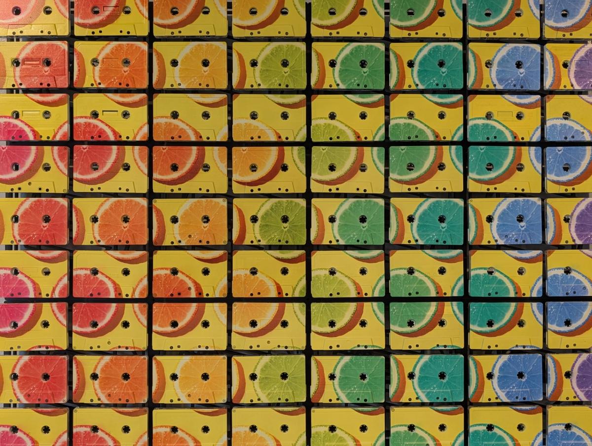
The citrus piece begins with yellow. A fairly committed yellow. Across it run slices of fruit in reds, oranges, greens, blues, and purples, which is an arrangement a greengrocer might reasonably question but a wall can accommodate with very little difficulty.
Then there is the black grid. It cuts the composition into cassette-sized rectangles and gives all that colour a framework. The piece is cheerful, but it is organised. Those two qualities get on rather well.
This is a useful introduction to how we think about colour at Mixtape Mosaic. A bold image should have a visual reason for being bold. The material should help it hold together. The result should remain interesting once the initial impact has worn off and you have lived with it through several ordinary Tuesdays.
Start with the whole image
Viewed from the front, the citrus reads as a repeated pattern with a broad shift in colour across it. Individual slices vary, but the circular forms give the eye something consistent to follow.
The yellow ground connects those forms. It keeps the work feeling like one composition rather than a collection of separate coloured tiles.
The dark cassette seams do another job. They set up a second pattern: straight lines against curves, rectangles against circles, regular spacing against the changing fruit. That relationship is the source of much of the energy.
Take away the fruit and you would have a grid. Take away the grid and you would have a different kind of picture. We like what happens when they are allowed to occupy the same surface.
A large shape can survive a small interruption
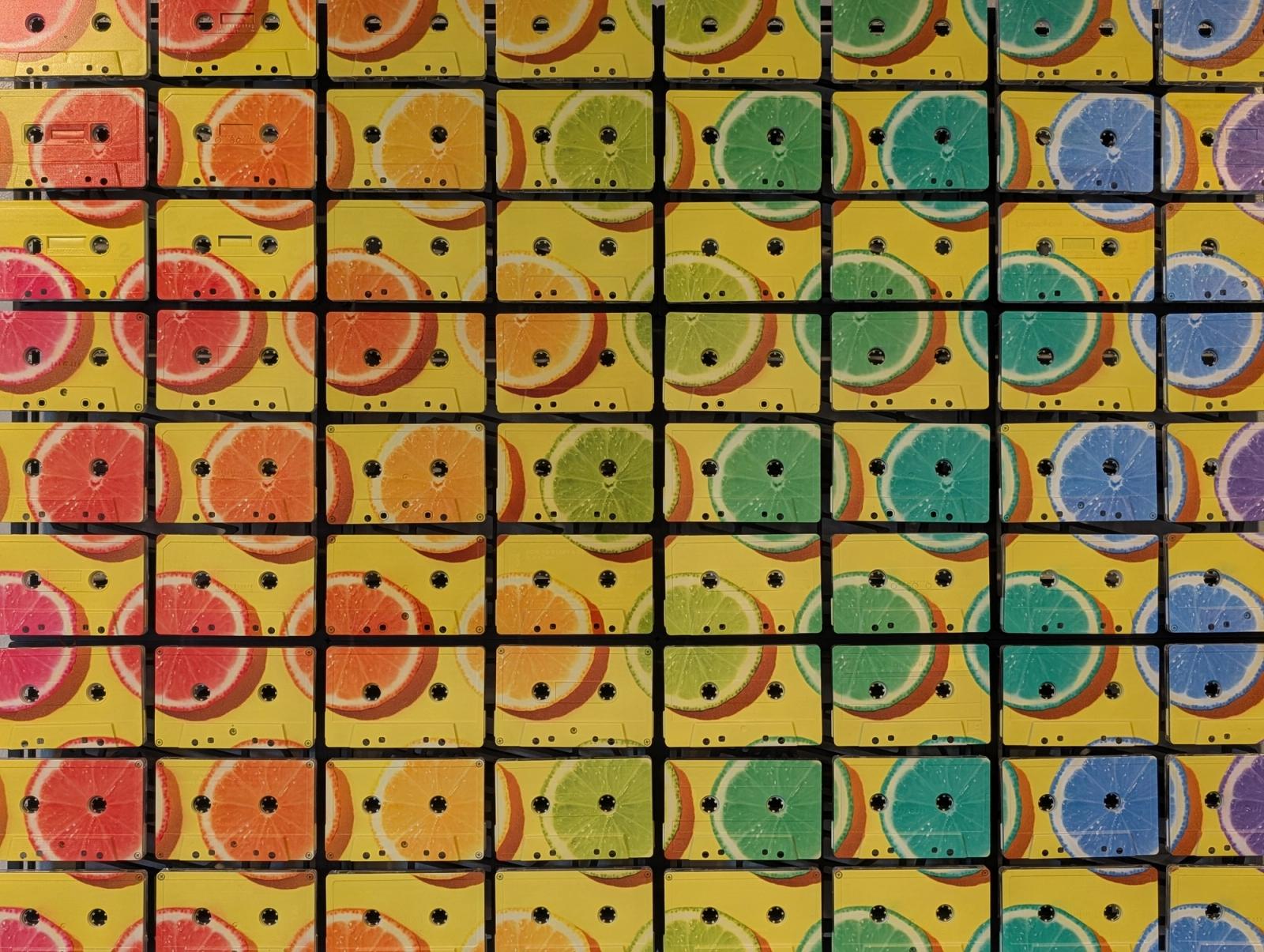
Each fruit slice crosses a surface with reel openings, shell edges, and gaps. Some parts disappear into those openings. Other parts continue on the next tape.
The circle remains recognisable because the broader shape is strong enough to survive the interruption.
That is a useful principle when choosing artwork for a cassette mosaic. Strong forms and clear differences in colour often carry well across the grid. Very fine details deserve more care, especially if they are essential to recognising the subject.
This is not a ban on detailed images. It is a reason to look at the preview as a composition, rather than assume that every pixel has been promised a private seat.
With the citrus, the material interruptions become part of the pattern. The fruit does not need a perfectly smooth surface to read as fruit. The cassette openings introduce another set of dark points inside the coloured forms.
The surface stays active.
Colour and texture together
Zoom into the work and the image acquires another character. You can see the tape faces as individual objects. The colour travels over shells that do not all present exactly the same physical details.
The yellow is still doing its broad compositional job, but it is now being read on a textured, broken surface. Edges and marks add smaller events within the larger design.
Move to an angle and shadows make the grid more pronounced. The front view is primarily about pattern and colour. The side view introduces the build.
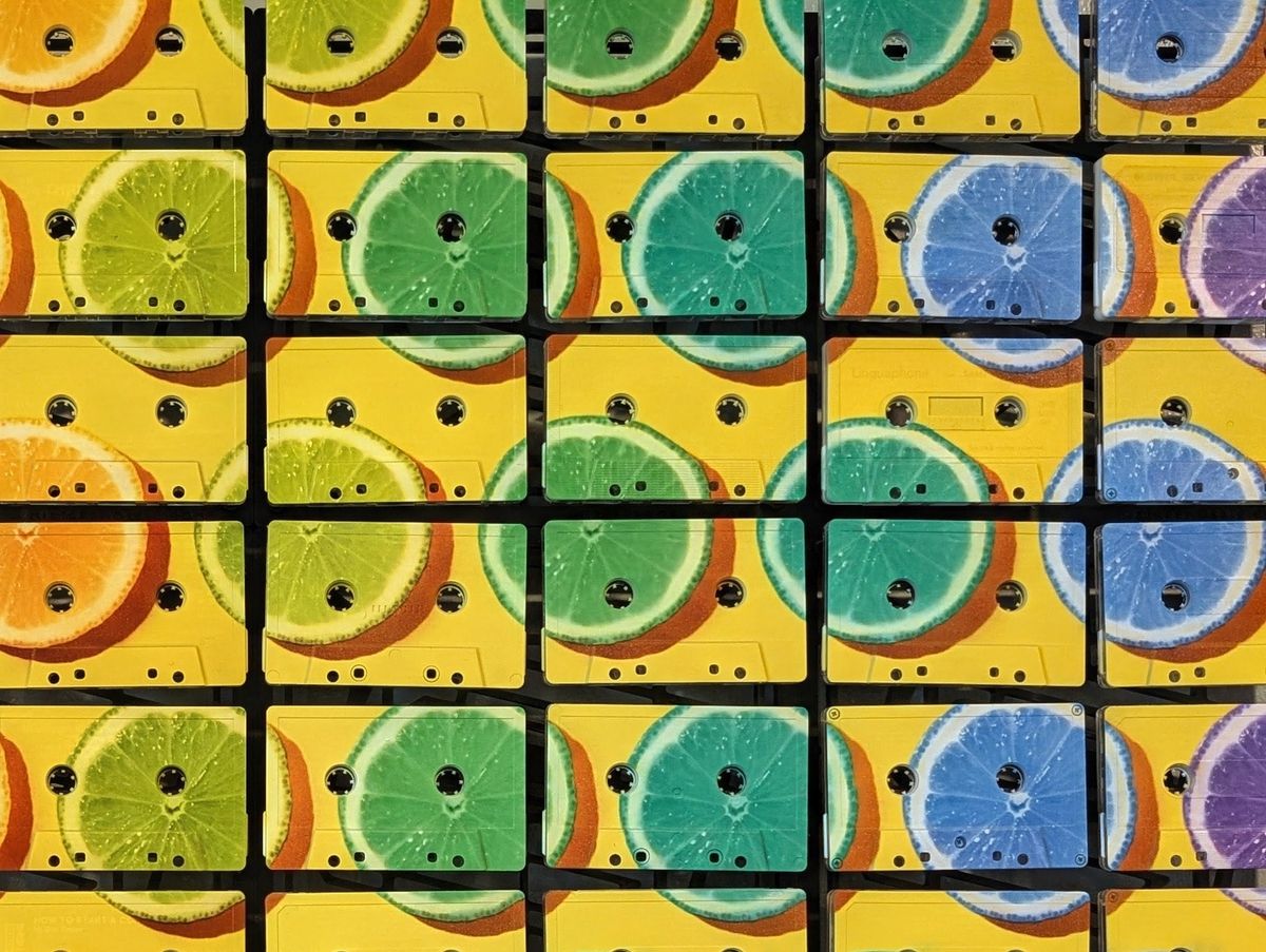
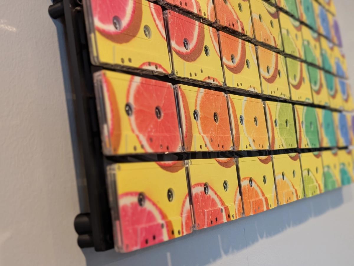
This is why we show both. A bright picture alone does not explain the appeal of a cassette mosaic. The colour needs to be seen in relation to the material carrying it.
Bringing colour into a room
You do not have to repeat every colour in a piece throughout the room. That would be a substantial undertaking with this one, and would eventually involve buying a purple object against your better judgement.
Choose one or two connections instead. A warm lamp, a textile, a small object on a shelf, or an existing colour in the furniture may be enough to make the work feel settled.
Alternatively, give it a quieter surrounding wall and let it be the main colour event. A room can be calm and still contain one emphatic piece. The calm may even make the colour easier to enjoy.
The most useful question is whether you want the artwork to join an existing palette or introduce a new note. Neither is inherently better. One creates continuity; the other creates focus.
Try looking at your proposed wall from the place where you usually sit. Think about the image as part of that view. It will live beside whatever is already there, including the item on the shelf you have stopped noticing but which remains extremely present.
Pattern can be the subject
Art does not always need a face, a place, or a personal photograph. Colour and repeated forms can be enough.
The citrus piece makes its appeal through the relationship between shapes, hues, and the cassette grid. It gives your eye routes to follow. You can enjoy the whole palette or get caught on a small passage where one slice crosses several shells.
That makes it an interesting option for someone who likes the material but does not want a music-themed image. The cassette is already the musical connection. The artwork is free to do something else.
This matters to our brand. Mixtape Mosaic can acknowledge where the material came from while making work that reaches beyond that origin. Fruit belongs here. Portraiture belongs here. Your own image can belong here too.
The colour you want to live with
Choose colour for the feeling you want in the room, but also for the way the image is built. A bright work with a clear composition can be easier to live with than a subdued work whose elements compete for your attention.
Look at the big forms first. Look at the balance of light and dark. Then examine how the cassette openings interact with the parts of the image you care about.
A preview is a practical tool for this. It lets you compare crops and scale before the work becomes a physical object. The artwork library is the place to begin if you want a studio-selected image; customizing gives you room to explore the arrangement.
Colour can change how a familiar room feels. It can make you notice a wall again. That small shift is worth taking seriously, even when the cause is a collection of magnificently implausible citrus slices.
Find your colour