After the First Look
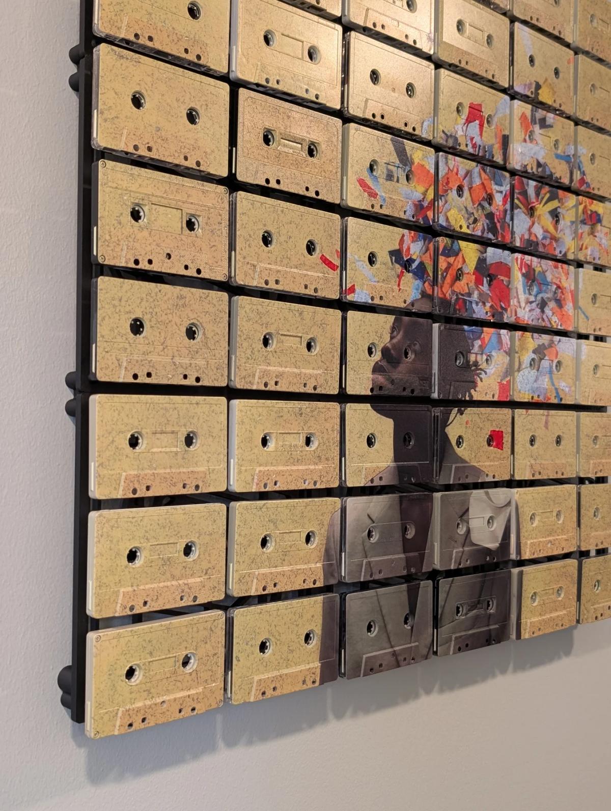
A faint original cassette label showing through a pale passage of UV print is not usually the first thing a Mixtape Mosaic tells you. Good. If that detail is trying to run the meeting, the larger image has probably gone for lunch.
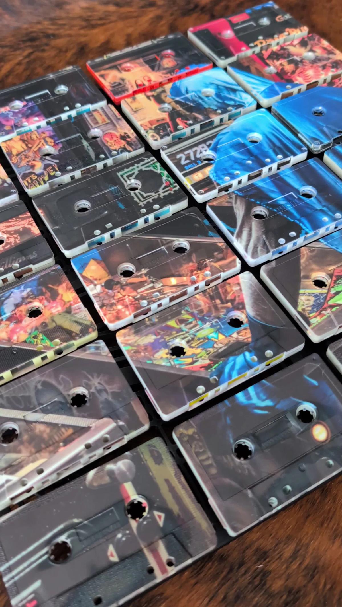
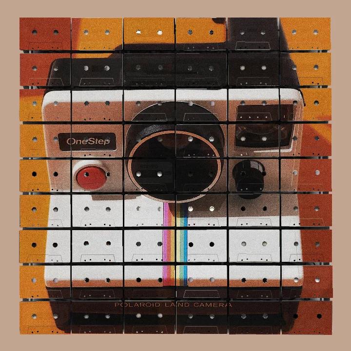
The first encounter is generally quicker. There is a portrait, a stretch of colour, a crisp silhouette or a row of citrus forms. Then comes the useful interruption: those rectangles are real vintage cassette faces. The reel openings are not drawn. The seams are not a texture. The shadows have been supplied by light, which remains the most reliable effects department in the business and does not answer email.
That discovery matters. It is also only the introduction.
Surprise has a short contract
The cassette construction gives Mixtape Mosaic an immediate point of difference, but an artwork cannot live on explanation alone. Once you know what it is made from, you know. The wall does not wipe your memory overnight and invite you to be astonished again before breakfast.
What remains has to be art: the strength of the subject, the balance of colour, the proportion of printed and quieter areas, and the way the image moves across a grid of objects. The cassette material should deepen that composition rather than rescue it.
This is why a little original label showing through a light-coloured section is so pleasing. It does not need to carry the full piece. It can wait until the eye has understood the larger image, then provide a smaller fact: this colour is sitting on an object that already had a face. The reward is modest, specific and repeatable. Nobody has to ring a bell.
What remains on an ordinary day
An artwork in a home is seen under conditions that would disappoint a launch committee. You pass it while carrying laundry. You notice it during a phone call. It sits behind someone who is explaining, at unnecessary length, why the router needs restarting. These are not lesser encounters. They are most of the encounters.
On the first day, a Mixtape Mosaic should still have a clear visual centre. A portrait needs presence. A graphic subject needs shape. A quieter work needs enough contrast and direction to hold together without turning every cassette into a separate announcement.
After a while, the grid stops being news and starts doing slower work. You notice how colour crosses one shell, disappears into a gap and resumes on the next. Morning light makes one set of edges distinct; evening light gives the shadow beneath the panel a little more weight. The artwork has not changed its mind. The room has simply given it different evidence.
Later still, one cassette may become familiar for a particular reason: a label edge, a different shell colour, the slight change in the moulding around a window, the print crossing a screw or an opening. None of this replaces the main image. It gives familiarity somewhere useful to land.
Quiet and bold are not opposites
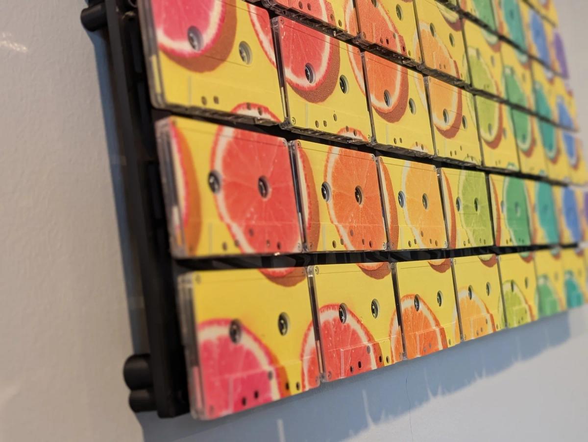
The two photographs above make different entrances. In the paler work, the eye gathers a partial portrait and a few concentrated printed forms from a field of visible cassette material. In the citrus piece, yellow and changing fruit colours arrive at once. One reveals itself gradually. The other introduces itself before you have properly removed your coat.
Both can last because neither relies on volume alone.
The quieter work has structure in the placement of the portrait, the open field and the coloured fragments. The brighter work has repetition, direction and a firm ground. In both, the cassette grid keeps the image from becoming slick. The openings and seams interrupt the surface at regular intervals, while the real variation between shells prevents those intervals from becoming mechanical wallpaper.
This is useful when choosing a piece. “Bold or quiet?” is only the first question. The better question is “What keeps this organised?” A loud palette without structure becomes tiring. A restrained palette without a clear composition simply becomes apologetic. Neither condition improves because the support happens to be clever.
Four questions after the introduction
When looking at a finished work, try temporarily setting aside the fact that it is made from cassettes. This feels faintly unfair, like judging a peacock without considering the tail, but it is a good test.
The last question is not a demand for a puzzle. A work can be direct and still reward familiarity. Repetition can reveal small exceptions. A pale area can make an older label visible. Morning and evening light can shift the shadows around the cassette edges. These are quiet changes, which is fortunate because the average wall has limited stamina for theatre.
The part that stays
Here is the honest bit. Art that lives with you becomes part of ordinary time. It sees good mornings, difficult weeks and a large number of meals that nobody will remember. The initial surprise fades, but affection can grow if the image still feels right and the material continues to offer something true.
For Mixtape Mosaic, that truth is physical. The contemporary image is UV printed onto real vintage cassette faces, and the finished work does not ask either layer to disappear. The picture holds the room. The objects keep their evidence. Familiarity does not flatten the piece; it gives you enough time to see what the first look was too busy to notice.
Explore the artworkThe Mixtape
J-card: "AFTER THE INTRODUCTION"
Side A
- Björk, “Jóga.” Large emotional contours with intricate activity beneath them, rather like a landscape refusing to remain scenery.
- Marvin Gaye, “What's Going On.” The surface is immediately welcoming; repeated listening reveals how many voices and details are quietly sharing it.
- The Avalanches, “Since I Left You.” Countless fragments assembled into one generous, continuous world.
- Cocteau Twins, “Heaven or Las Vegas.” First a wash of colour, then a song whose internal shapes become clearer with familiarity.
- Minnie Riperton, “Les Fleurs.” A poised beginning that keeps opening until the arrangement fills the whole field.
Side B- Arthur Russell, “This Is How We Walk on the Moon.” Small changes accumulate without asking for a grand announcement.
- My Bloody Valentine, “When You Sleep.” Dense at first, remarkably precise once the ear adjusts to the surface.
- The Durutti Column, “Sketch for Summer.” A spare construction that proves quiet need not mean slight.
- Lee Morgan, “Search for the New Land.” Patient, spacious playing that rewards attention rather than demanding it.
- The Sundays, “Here's Where the Story Ends.” Bright, clean lines with a lingering undertow, an ending that makes another listen feel sensible.