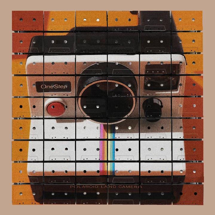
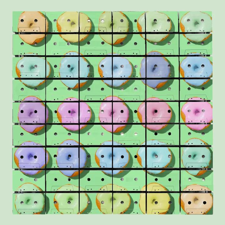
A Wall Full of Different Answers
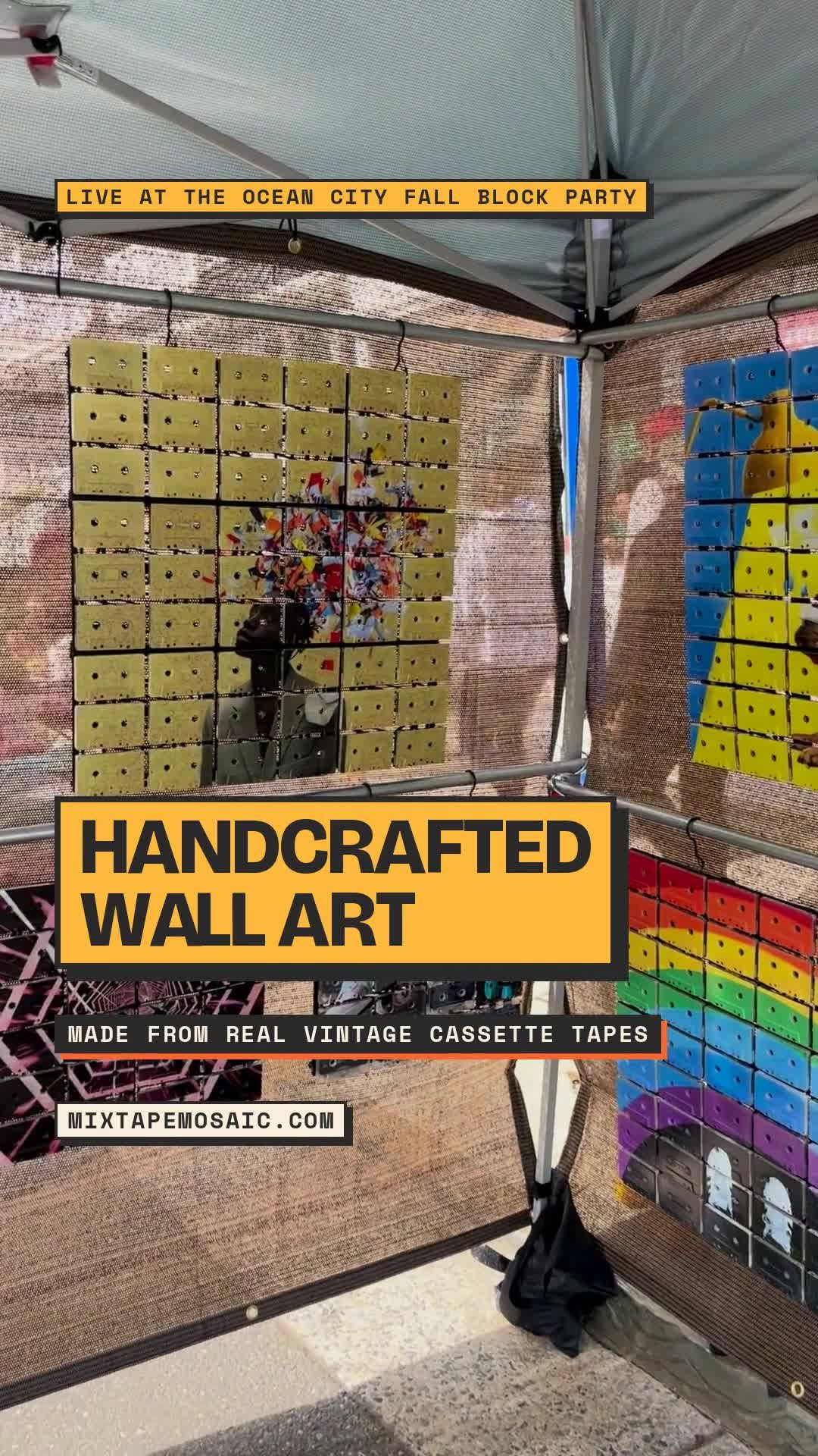
An original cassette label showing through a pale section of print is a detail that asks for twelve inches and ten seconds. A wall full of finished Mixtape Mosaics grants neither at first. It offers a rainbow, a portrait, a field of citrus, a dark silhouette and several other firm opinions at once, like an unusually disciplined argument in which every participant is made of cassettes.
This is useful.
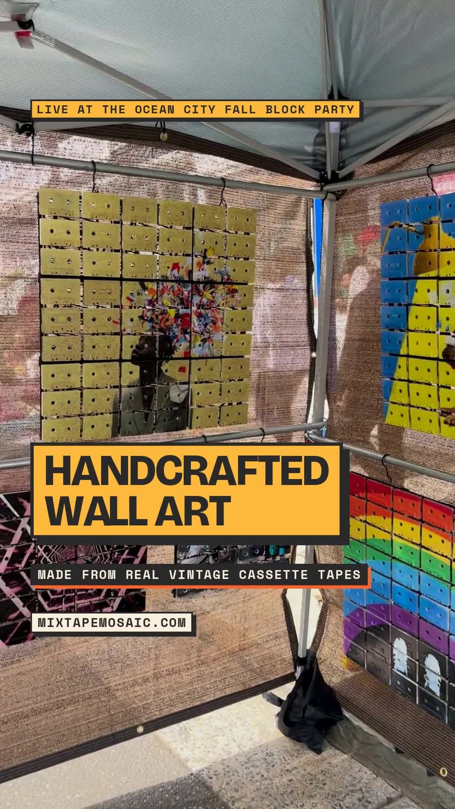
At the Ocean City Fall Block Party, the work had to share a public display rather than enjoy the flattering solitude of a studio photograph. The new footage shows several finished pieces together. Bright work sits beside quieter work. Dense images sit beside compositions with broad areas of visible cassette shell. Original markings appear in the lighter passages, but only after the larger images have done their work from a distance.
A single artwork can tell us whether it succeeds. A wall of them tells us what Mixtape Mosaic is.
The group test
Putting several pieces together removes a convenient illusion: that one successful image defines the whole brand. On the show wall, a blue-and-yellow figure does not look much like a pink vehicle scene. A rainbow ending in white sneakers does not resemble a pale composition with only a concentrated area of print. The subjects, palettes and amounts of open material vary considerably.
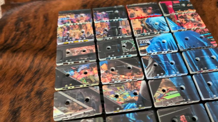
Yet the wall does not feel accidental. Every piece begins with the same physical grammar: real vintage cassette faces, a rectangular grid, paired reel openings, shell edges, dark gaps and a contemporary image UV printed across the assembled surface. Those elements are not a theme pasted onto the artwork. They are the construction that holds very different artwork together.
That distinction matters. A brand can become recognisable by repeating one colour, one subject or one mood until everyone involved needs a short lie-down. Mixtape Mosaic is recognisable because the material and process remain consistent while the images are allowed to move.
Loud is not the same as strong
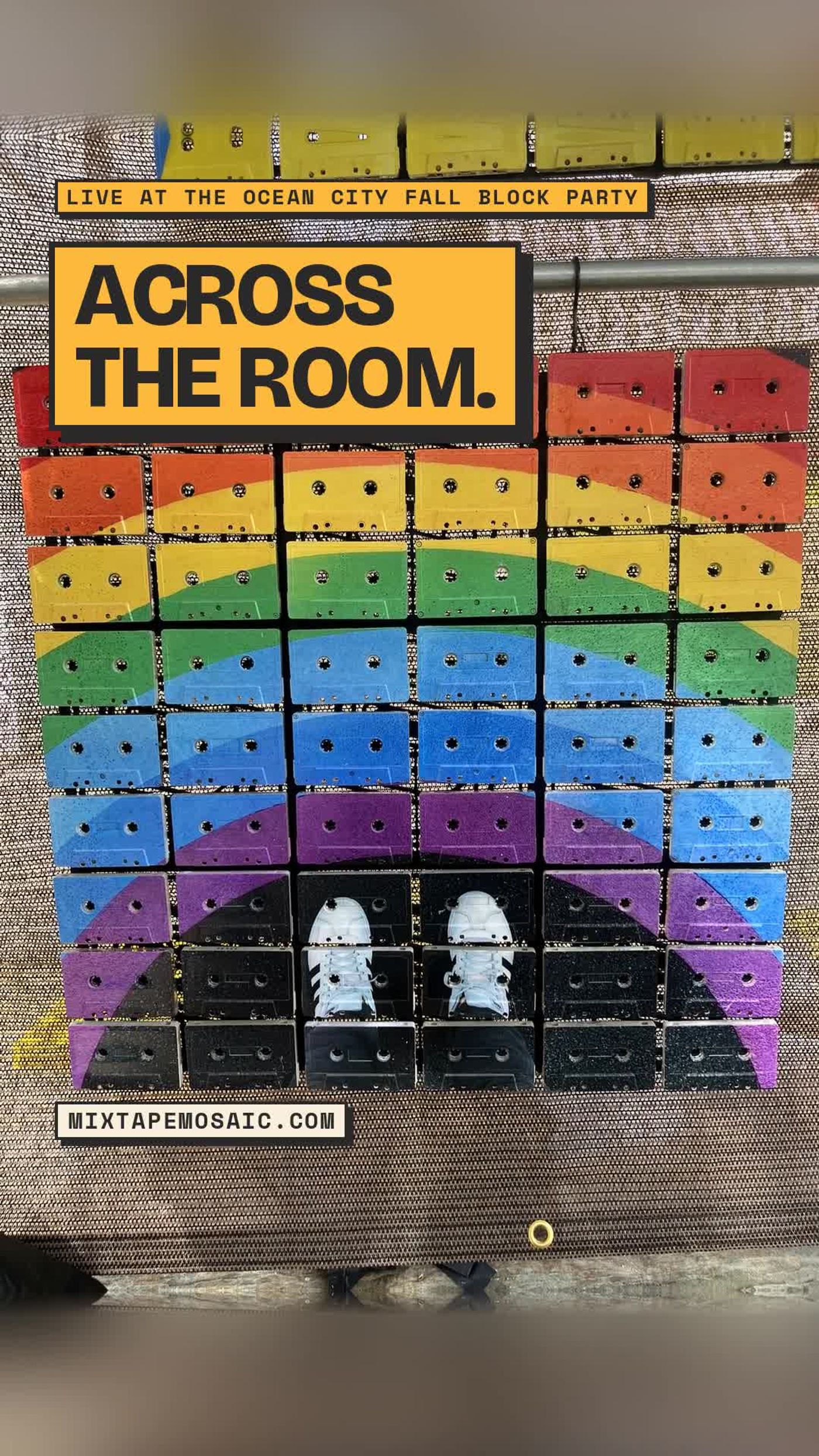
The rainbow piece makes its entrance from some distance away. It has large colour bands, an uncomplicated direction of travel and a pair of white shoes that provide a clear destination. It does not require the viewer to solve a committee report before understanding where to look.
Other pieces use less colour and more exposed shell. They are not weaker. Their first read is quieter, then their material becomes more prominent. A pale tape, a manufacturer mark or the edge of an original label can carry more weight because there is less printed information competing with it.
This is the useful range. A bold piece should still contain reasons to approach it. A restrained piece should still make a coherent image from across the room. Volume alone is a poor measure of presence. Anyone who has stood near a portable loudspeaker at an outdoor event already understands this, usually too late.
The useful sequence
The phrase “wow factor” tends to be treated as if the artwork should shout one syllable indefinitely. A physical cassette mosaic works better in stages.
First comes recognition of the image. A figure, a rainbow, a face or a graphic field resolves across the grid. Then comes the material surprise: the rectangles are individual vintage cassettes rather than a printed imitation of them. Finally, the small evidence arrives. Reel windows interrupt colour. Shells vary. Older lettering remains faintly present beneath a lighter passage. Shadows collect in the gaps.
That sequence explains why the work photographs well but cannot be exhausted by a photograph. The large composition is available to the camera. The changing relationship between print, object and light belongs to the room.
Comparing without ranking
Seeing several works together is helpful because comparison sharpens preference. It does not need to produce a winner. The point is to notice which kind of image keeps bringing your eye back.
These questions work whether you are choosing a studio image or uploading your own. They shift the decision away from “Which picture is best?” and towards the more useful “Which encounter do I want to live with?” A home is not an art competition. It is difficult enough to keep the good scissors in an agreed location.
There is also a practical lesson for making the work. The cassette grid should not merely survive the image. It should contribute differently to each one. On a large, graphic composition, the grid can organise the colour. On a quieter work, the shells themselves can occupy more of the visual field. In a detailed image, the breaks can introduce rhythm and prevent the surface from becoming slick.
What the wall clarified
Here is the sincere part. Seeing the pieces together makes the ambition clearer: we do not want the cassette to be a novelty that carries one quick idea. We want it to be a serious, flexible material for contemporary images, recognisable across work that can still feel entirely individual.
The show wall provides good evidence. No single artwork has to explain the whole studio. The colourful pieces can be generous. The quieter pieces can take their time. The common grid keeps them in conversation, and the real objects make every composition slightly more complicated than a flat image would be.
That is the particular pleasure of Mixtape Mosaic. From a distance, the wall has range. Up close, every cassette has edges.
Compare the artwork