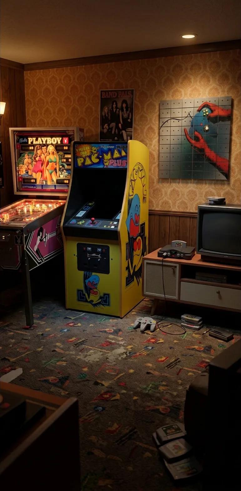
Neon Colors and Hard Edges
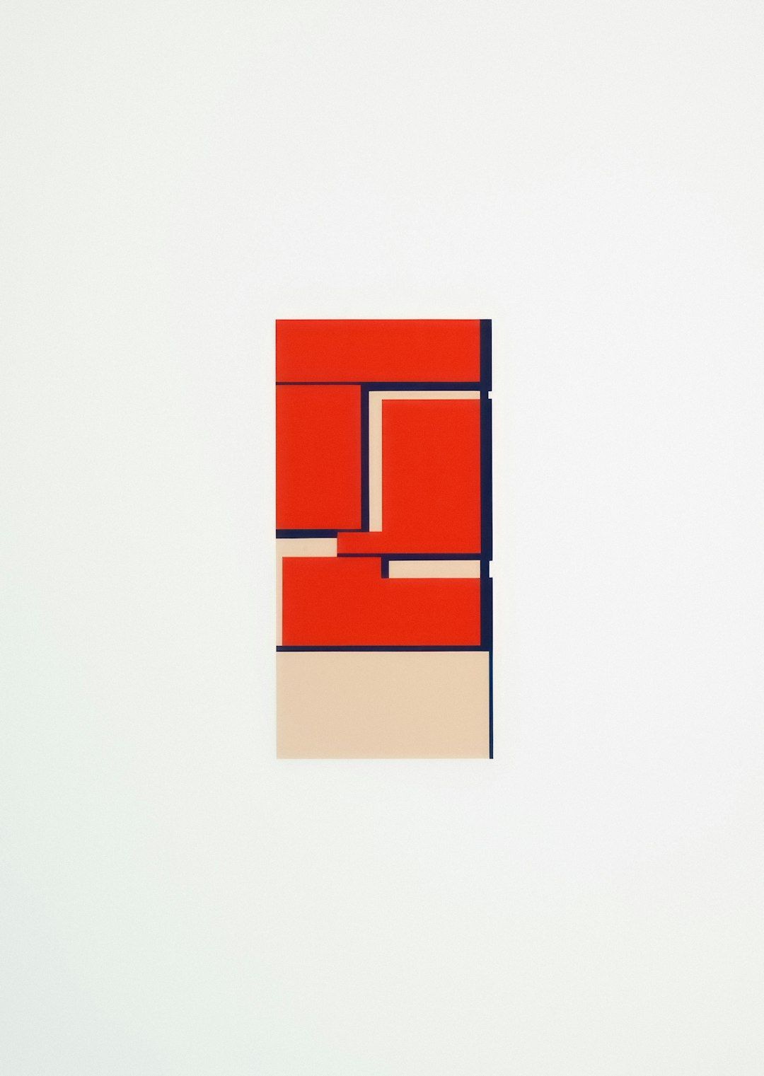
The trouble began with a highlighter.
I had placed it, quite responsibly, beside a stack of black cassette shells while considering the sober question of whether a particular image required more magenta. The highlighter rolled off the table, struck a tape, and produced a luminous yellow streak across my notes that looked less like an accident and more like a municipal warning.
I could not help but notice that the page had improved, though perhaps I could have, had I been paying any attention.
This is how one arrives at a theory of neon. Not through discipline, taste, or the patient study of Josef Albers, but because an office supply makes a compelling argument at speed.
The chromatic emergency
It is generally accepted, among those who accept such things, that bright color exists to attract attention. This is true but incomplete. A fire engine attracts attention. So does a man trying to carry six dining chairs through a revolving door. Neither is necessarily art, although the chair incident may qualify under certain municipal grant programs.
In a Mixtape Mosaic, color has a more difficult assignment. It must travel across real vintage cassette tapes. These are not polite, blank surfaces. They have label windows, hubs, screws, ridges, scuffs, handwritten titles, and the occasional bit of adhesive whose chemical ambitions remain unknown.
A quiet image can become timid when distributed across so much physical information. Bold color gives it enough authority to survive the trip.
This is why saturated orange, cyan, magenta, yellow, red, and deep black appear so naturally in cassette art. The colors do not conceal the object. They negotiate with it, often loudly and with the confidence of a person who has brought supporting documents.
Hard edges and the ancient rectangle
Every cassette is a rectangle, a fact I verified personally with a ruler and then again with another ruler after doubting the first one. Repetition turns that rectangle into a grid. The grid exists before the artwork arrives, which means the image must either cooperate with it or spend the remainder of the afternoon losing an argument.
Strong outlines, clear silhouettes, and decisive areas of light and dark work beautifully because they allow the image to cross the grid without becoming vague. A face remains a face. A sneaker remains a sneaker. A flamingo, which is already doing more visual work than most birds, remains unmistakably a flamingo.
Curves become more interesting against hard cassette edges. Soft gradients acquire interruptions. Letterforms gain structure. From across the room, the composition reads as one image. Up close, it breaks into shells, windows, labels, shadows, and many small decisions.
Scholars at the Institute for Applied Rectangle Studies call this the Dual Recognition Event.(1) The institute is located behind a carpet store and does not answer email.
Why some images behave better than others
For custom artwork, strong contrast matters. So does a clear subject. A high-resolution original file gives us more useful information than a screenshot, a thumbnail, or a photograph downloaded from a group text in 2014.
The best source images usually possess several of the following virtues:
- A clear focal point
- Strong separation between subject and background
- Color that can be simplified without losing its mood
- Enough resolution for a large physical composition
- A crop that suits the selected format
Busy images can work, but they need an anchor. Without one, the eye wanders around the grid like a visitor who has misplaced both the coat check and the purpose of the evening.
Customers can choose curated artwork or upload an image they own or have permission to reproduce. The customizer provides a realistic preview of the overall direction. The finished piece will still carry natural variations in shell color, labels, spacing, wear, and alignment because it is built from authentic vintage tapes.
Pixel-perfect uniformity is not available. Character is.
The color is new, but the material remembers
This is the part that keeps neon from becoming merely decorative.
A bright field of yellow may pass across a cassette that once held a road-trip mix. A band of blue may leave a handwritten label partly visible. A deep shadow may be interrupted by a pale shell that spent twenty years in somebody's basement, waiting with admirable patience for a second career.
The artwork is contemporary, but the surface is an archive. The colors arrive today. The scratches got here earlier.
Only a fool, or a licensed Beige Preservation Officer, would contest the point: brightness and age are not opposites. Together they create tension. New image, old object. Bold composition, unruly detail. One picture, many small histories.
The highlighter remains on my desk, although it now occupies a shallow tray under conditions established by the Geneva Office Supply Accords of 1997.(2) We have reached an understanding.
In the end, what I learned is this: when color makes a scene, let it finish. It may know exactly what the room needs.
Notes of dubious authority
- M. P. Dalloway, "Rectangles That Become Other Things When Viewed from the Hallway," Proceedings of the Institute for Applied Rectangle Studies, Vol. 4, probably.
- The Geneva Office Supply Accords are most often cited by people who have recently spilled something.